
Waterfall Helper Tutorial
The Waterfall Chart Helper creates six types of Waterfall Charts. There are two kinds of each type "regular", "rotated" and "stacked". What is best depends on the purpose. In general, the more complex the chart is, the more space its formulas consume and also formatting tends to be more limited.
We recommend getting started by visiting the example files in our gallery and recreating them using the add-in.
Steps for Creating a Waterfall Chart with subtotal column
1) Arrange input data

Data needs to be organized into columns:
- Column #1 with labels
- Column #2 with data
You need empty columns to the right for the formulas. How many depends on the type of waterfall chart.
2) Select ' Waterfall above axis' from the ribbon menu
Initially, the code does not recognize that 'Products' is a subtotal and should sit on the x-axis.


3) Mark rows with subtotals
Putting a "y" into the 'is a total' column marks 'Products' as a subtotal row and fixes the subtotal column.


Notes
- Other chart types work alike
- It is possible to add rows. You just have to copy the formula from the above row to the second last row. Deleting rows does not require changes to the formula.
- Horizontal waterfall charts may not cross the y-axis into negatives
- Stacked waterfall charts may not have negative stacks
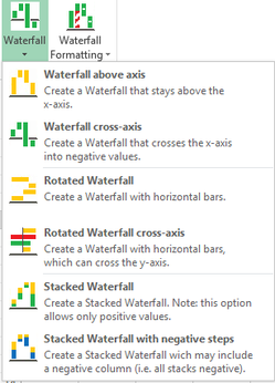
Three TYPES OF Waterfall Charts
There are three basic types of waterfall charts; each comes in two variants:
- a - Waterfall chart
b - Waterfall chart cross x-axis - a - Rotated waterfall
b - Rotated waterfall chart cross y-axis - a - Stacked waterfall chart
b - Stacked waterfall chart with negative stacks
Note:
- Type 1 is a newly added native chart in Microsoft Excel 2016 (though our tool offers some minor advantages in formatting).
- You can always opt to use the three b-variants, because they cover everything a-variant can do, too. But they have a disadvantage: formulas and sometimes formatting is more complex.
(Classic) Waterfall charts

The Waterfall above axis type is easy and flexible to format. There are two data series: one is transparent at the bottom and one is colored 'floating on top' of the transparent columns. Formatting is much like a regular stacked column chart in MS Excel.
The Waterfall crossing the axis has one drawback: 'up' and 'down'-columns are acutall error bars of a line chart. They cannot be formatted indivdually, so e.g. all up columns will have the same color.
Rotated waterfall charts

The horizontal Waterfall is much alike the Waterfall above axis. This is stacked horizontal bar chart with one series being transparent. It cannot cross the axis into negative values.

Stacked waterfall charts

The horizontal Waterfall is much alike the Waterfall above axis, but here we have more stacks. There is also a total computed for the stacks. While formatting is pretty flexible, it cannot have negative stacks.

Video Tutorial On the Basic STEPS for Creating the Four Chart Types
Formatting Waterfall Charts
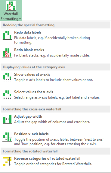
Redoing the special formatting
In the event that your editing of the chart has resulted in unwanted changes there are to options for fixing:
- Redo data labels will remove data labels from blank column stacks and rework the other labels to correctly display values
- Redo blank stacks will set the color of theses back to transparent
Displaying values at the x-axis
- Show values - If you want to display further values along with x-axis labels, you can add an extra cell range, e.g. with the percentages of the total, while the waterfall displays absolute values.
- Select values allows you to manually select a range for x-axis labels and additional values.
Formatting the cross-axis waterfall charts
Position labels - If waterfalls are crossing the x-axis into negative values, you can lower the labels of that axis, so they will be below the chart and not next to the axis.
Adjust gap width - The cross-axis waterfall is constructed out of a column chart and the error bars of a line chart. Setting gap width here will set both to the selected value.
Formatting the horizontal waterfall chart
Reverse horizontal waterfall - Press here to toggle the order of categories along the vertical axis.
Adding and Removing Columns
Adding columns to an existing chart:
- Insert rows into the data table and add the data and its label
- Restore the formulas by drag©ing the second row of formulas until the row before the bottom row
- Run 'Redo labels' to show the data labels at the new columns
Deleting columns:
- Delete the rows of the columns you want to remove
- Restore the formulas by drag©ing the second top row to the second last row.